


Let's work together!
Two students in a classroom working through a Talmud passage on a tablet, with a color-coded flowchart of the argument's structure on screen.

Interactive Talmud Study Platform

Gemara Berura develops an educational platform that helps students understand complex Talmudic texts by highlighting keywords, annotating text, and creating visual flowcharts that clarify the structure of the discourse. One of the projects I worked on with them was redesigning their interface. We focused on optimizing the user experience for both teachers and students, transforming a complex methodology into an intuitive digital learning tool.

Client
Gemara Berura
Year
2018 - Present
My Role
UX/UI Designer
Platform
Web application
Mockup of the Gemara Berura study interface open in a browser window, showing Talmud text alongside a segmented flow diagram.
A frustrated student in a classroom, head in hand, struggling over an open book.

The Problem

Complex Text,
Lost Students.

The Talmud is an ancient text written in a dense, non-linear style.
Students often struggle to follow its logic or connect its parts.
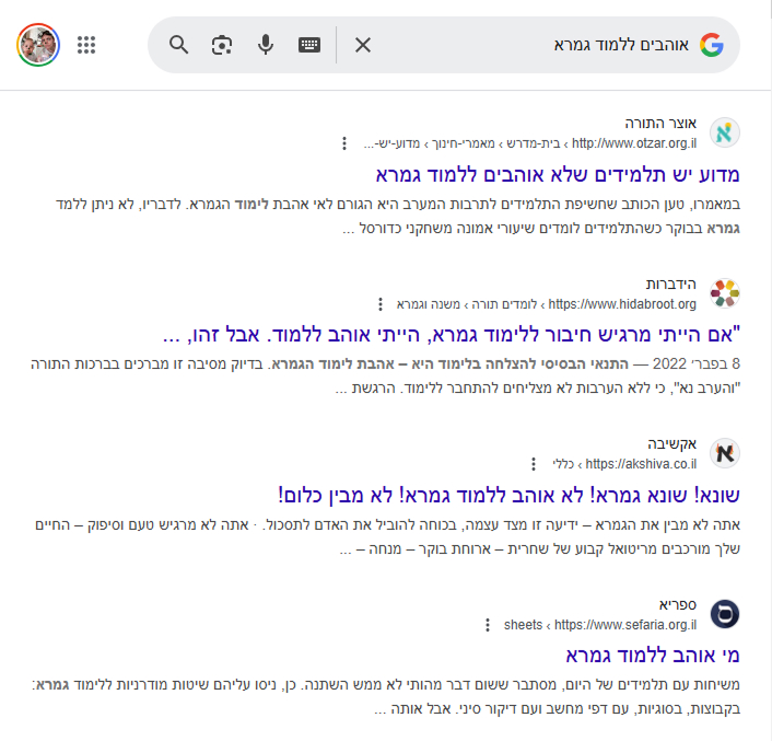
A quick search for "I love learning Talmud" returns only frustration.

A Google search results page for the Hebrew phrase 'love learning Talmud,' returning results about people struggling with or disliking Talmud study.

The solution

Break down to build up

Like LEGO or a puzzle, students interactively break the Talmud text into logical parts, tag their roles, and reassemble them into a clear, visual flow. This hands-on method transforms dense learning into an engaging experience.

Divide the text into logical segments

Label each part by its role (question, answer, objection, etc.)

Create visual links between segments

Highlight and get explanations for key words

Learn more about the sages mentioned in the text

Translate Aramaic terms

View a live flow diagram of the structure

These tools help students see the logic behind the text, stay focused, and truly engage with the material.

Redesign

Why I redesigned it

In 2018, I was brought into the project to design the UI based on a detailed UX spec that had already been defined. Over the years, as I continued to work with the product and saw how it was actually used, I realized some core interactions needed a fresh UX approach.

What I changed

01

In-place segmentation tools

Before:
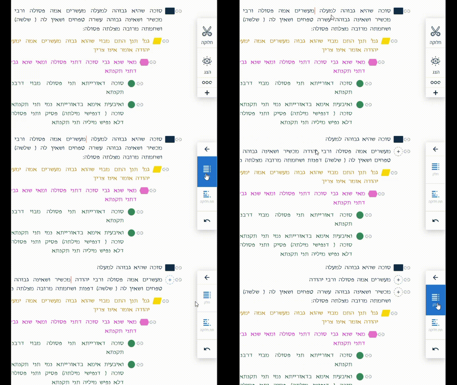
Old segmentation UI: a side panel with a scissors 'divide' icon has to be opened separately from the text to split a passage.

Students had to open the "Segment" menu and move back and forth between it and the text for every cut.

My solution:
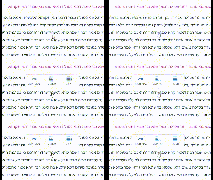
New segmentation UI: clicking between two words opens a floating menu with Divide, Subdivide, and Undo options.

Clicking between two words opens a floating menu with Divide, Subdivide, and Undo - plus keyboard shortcuts for fast use.

02

Display tools, simplified

Tools like highlighting sages' names or translating Aramaic words were buried in a secondary "View" menu, forcing users back in just to turn them off. I moved everything into a fixed bottom toolbar - always visible, always accessible.

The redesigned bottom toolbar, showing icons for divide, redo, hide, keyword search, sages, Aramaic dictionary, and zoom controls, all in one row.
03

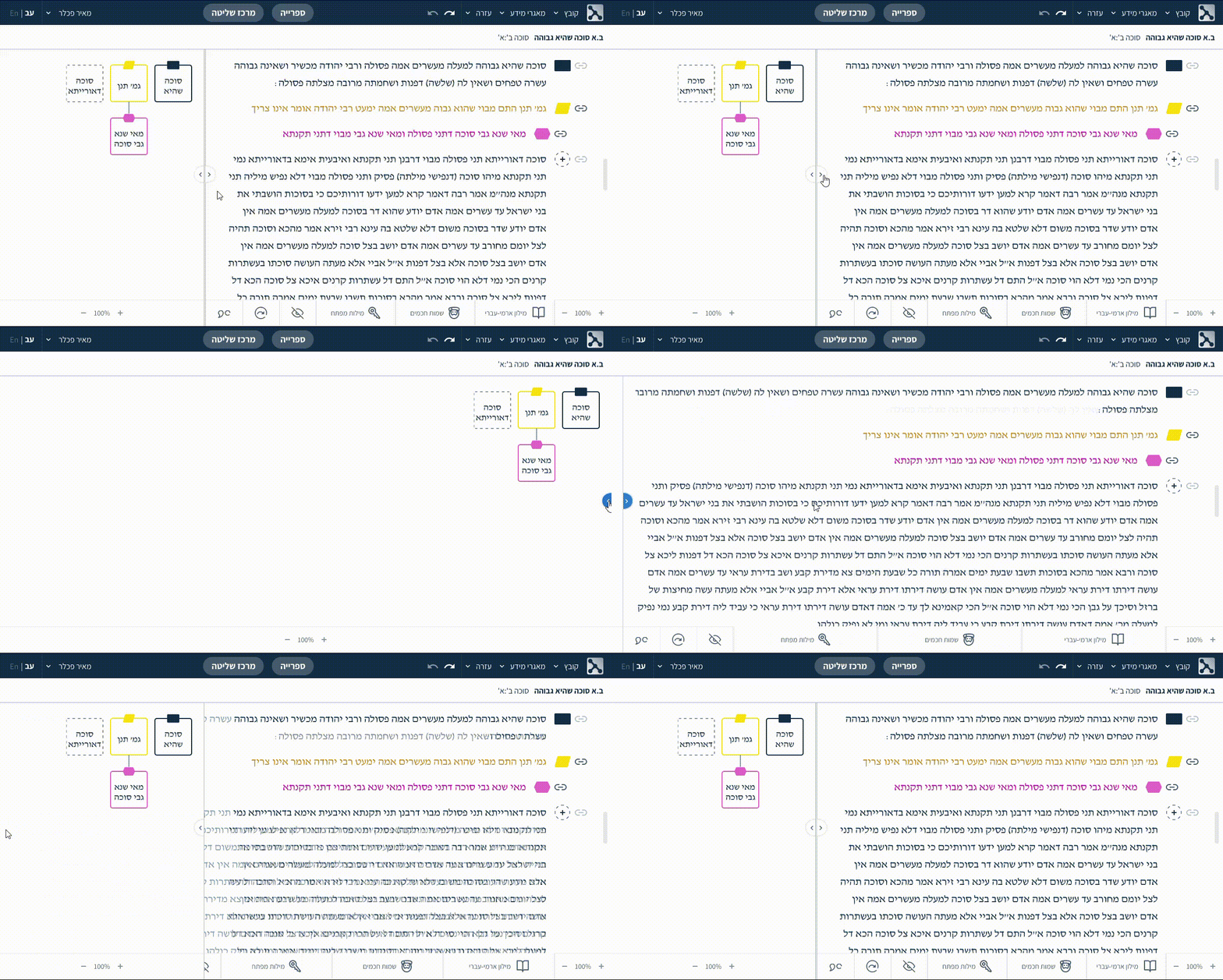
Panel visibility made intuitive

Hiding the text or diagram meant digging through a menu behind an eye icon. I replaced it with simple arrow buttons at the center of the screen - one click to show or hide each side.

New panel-visibility UI: arrow buttons at the center of the screen collapse the text or diagram panel, with the same controls also grouped in the bottom toolbar.

The result

Clearer. Smoother.
Smarter.

The interface became faster to use, easier to navigate, and more intuitive overall.
By simplifying the layout and making key tools visible at all times, users can now divide and work with the text without friction - no more jumping between menus or hunting for buttons.
Everything just works the way you'd expect.