
Connecting Empty Trucks with Urgent Deliveries
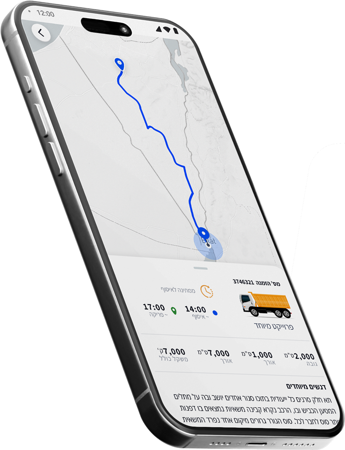
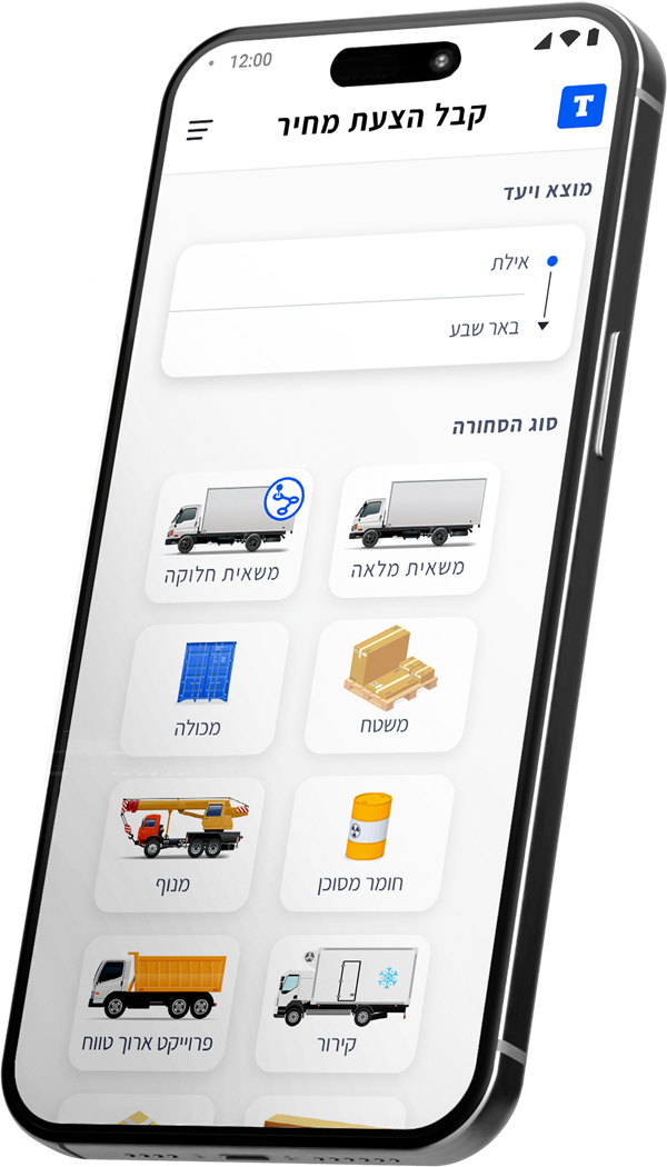
Truckiby is a platform that connects truck drivers returning empty with suppliers who need last-minute deliveries - turning unused space into efficient, cost-saving transport. I designed the UX and UI for the supplier and driver apps, along with the landing page and marketing materials, helping bring this early-stage startup from concept to functional prototype.
The Problem
Empty trucks, wasted opportunities
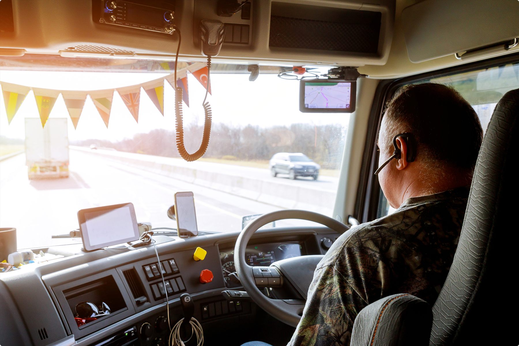
Every day, trucks drive back empty - wasting fuel and revenue. At the same time, suppliers are stuck with urgent cargo and no one to move it. A better match would benefit both sides.
The solution
Smart. Fast. On the way.
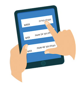
Truckiby streamlines urgent deliveries by instantly matching suppliers with available drivers on their return routes. No phone calls, no coordination chaos - just a few taps and your delivery is on the move.

User Research
Real Pain, Real Demand
We started by surveying the client’s existing suppliers. 21 participants answered a detailed questionnaire I prepared. Here are some of the insights:


Jobs to Be Done
From Stress to Speed, from Waste to Profit
After analyzing the survey responses, I mapped out the core motivations for each user group:

“I want to find a nearby driver on my own, fast and affordably - without paying for special delivery.”
Moty Yechezkel, Logistics Manager

“I want to make extra money on my way back by picking up cargo that fits my route.”
Sassi Eliahu, Truck Driver
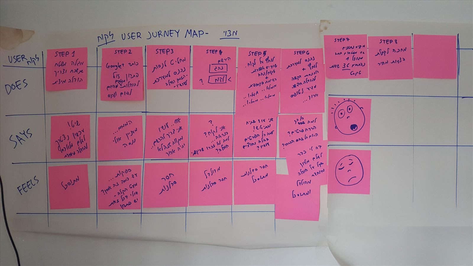
To guide ideation, I created a user journey map showing the emotional and practical steps users go through - from initial frustration to delivery confirmation.
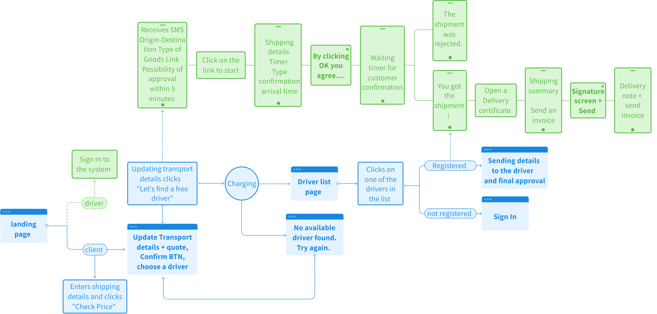
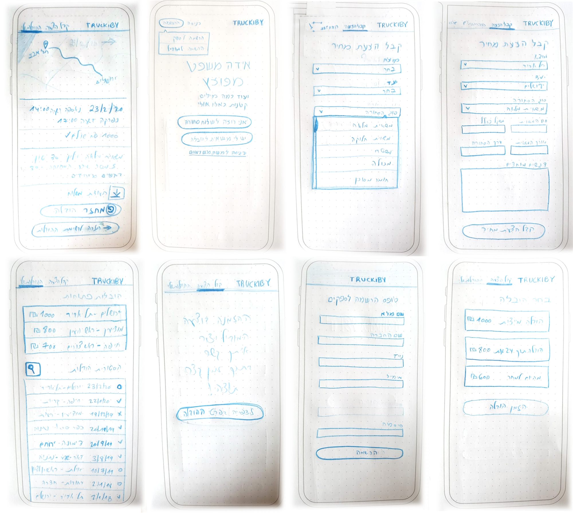
To map out the product’s core flow and define the MVP scope, I sketched early UX wireframes and explored the end-to-end interaction from both client and driver perspectives.
Design
Fast, simple, and built for real-world urgency
A mobile-first interface designed to make urgent delivery booking effortless - even for users with low digital literacy.